
Portfolio
Unorthodox Charters
Created a custom website for a local charter captain to showcase services, trip options, and photos of past trips. The goal was to build trust with potential customers while making it simple to view all trip details and contact the captain.
Fully custom website design
Clear service structure and calls to action
Optimized for mobile and tourist traffic
Bluewater Charter 30A
Updated and expanded an existing website by designing and adding new pages, improving layout consistency, and adding custom widgets to link to Fishing Booker. These updates helped create a more professional and user-friendly experience.
New page layouts (gallery and reviews)
Edited promo video for homepage
Improved navigation on-site and off-site
Custom widgets added
Atlas & Clay
Designed and built this business website and logo from the ground up to reflect my design style and clearly communicate my services. The site focuses on clean layouts, appealing colors, and an intuitive user experience.
Custom website built from scratch
Unique logo, brand kit, and cards
Mobile-optimized and easy to navigate
Designer to convert visitors into inquiries
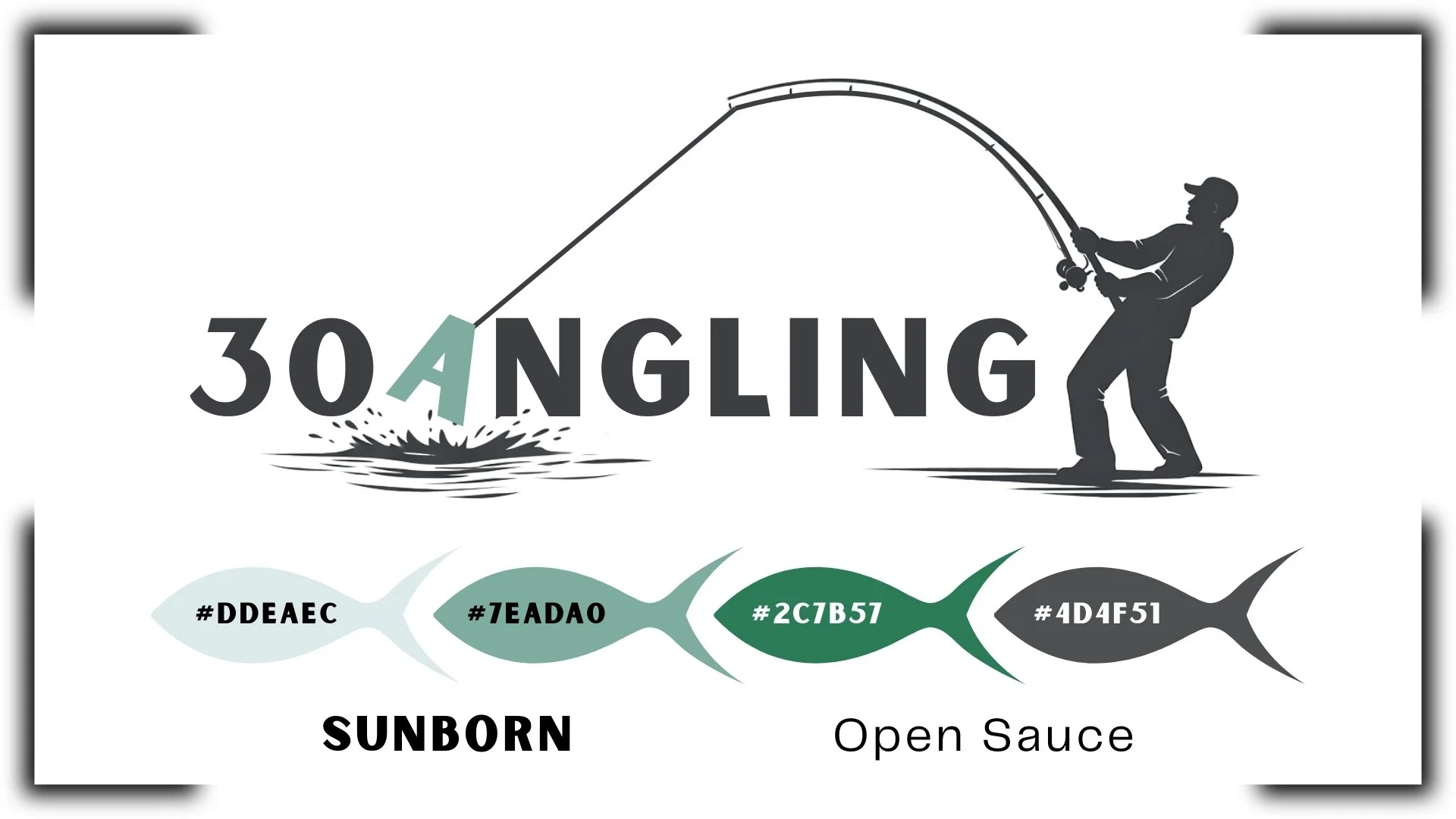
30Angling
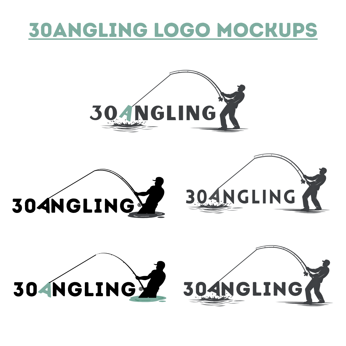
I worked with 30Angling, a surf fishing rod company, to develop a cohesive brand direction that feels bold, coastal, and functional. This project focused on refining their visual identity through logo concepts, real-world mockups, and a brand style guide to ensure consistency across future marketing and digital platforms.
Custom logo concepts and refinements
Logo mockups applied to apparel and gear
Brand color palette and typography selection
Visual style guide outlining logo usage and brand direction
Website design completed but not yet launched.
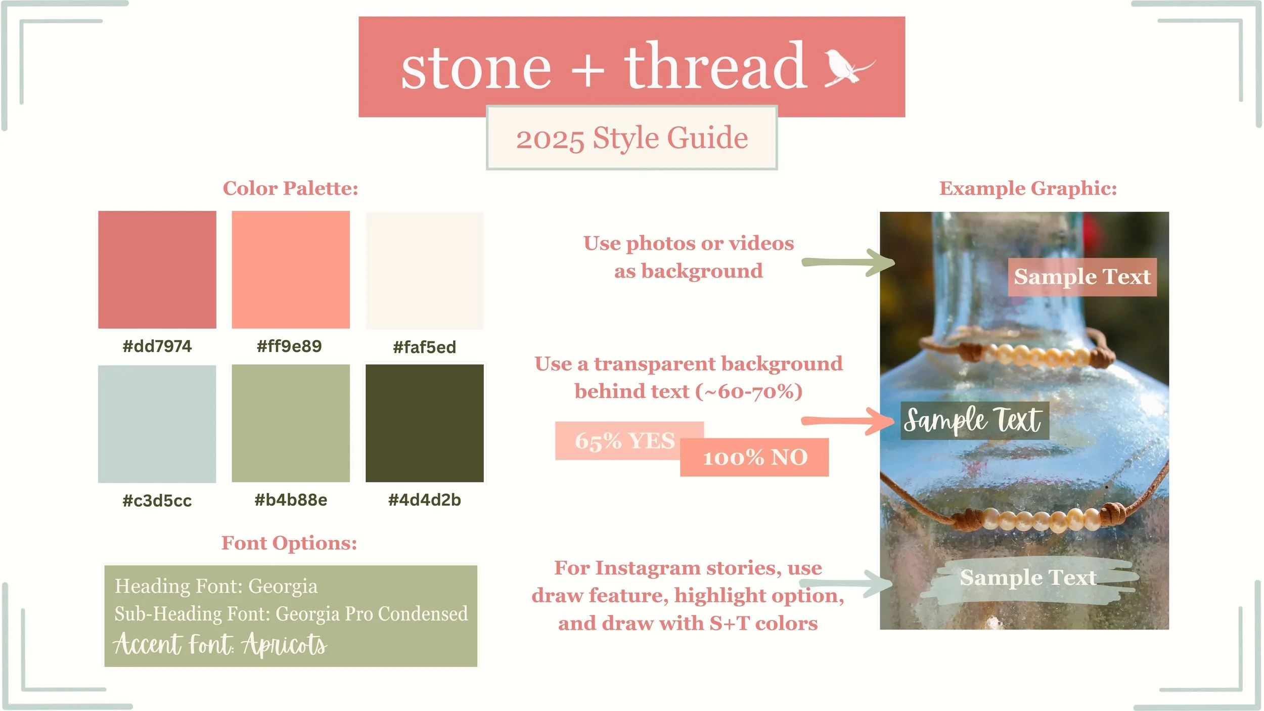
Stone + Thread 30A
Created a cohesive brand style guide to establish a clear and consistent visual direction. The guide was designed to support everyday marketing and social media needs, while leaving flexibility as the brand grows.
Curated color palette for digital and print use
Font selections and typography direction
Example graphic for brand application
Guidelines for using transparent backgrounds
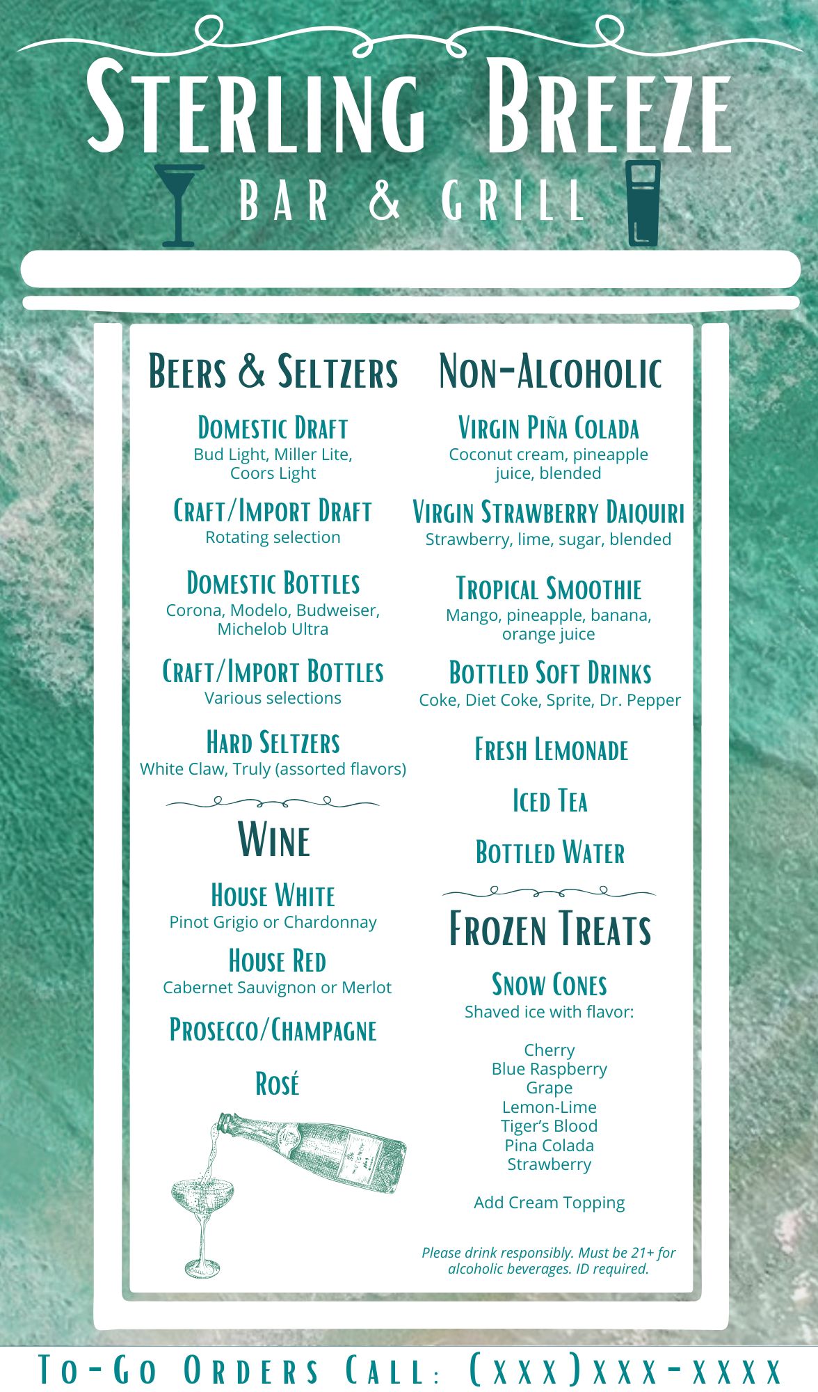
Sample Menus
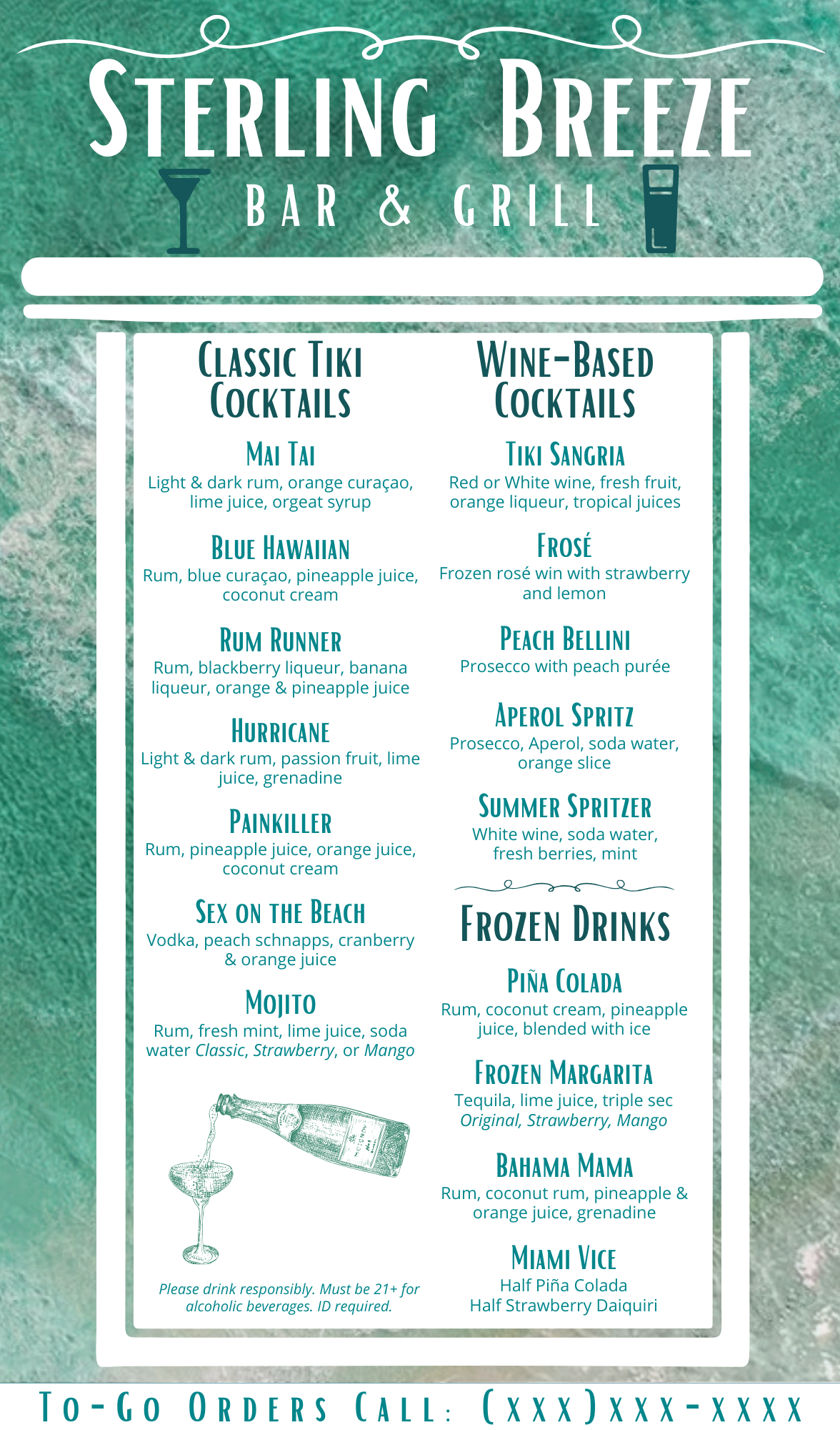
Designed a set of concept menus for a bar and grill to explore visual direction, layout, and brand personality. The menus balance clarity with character, creating an inviting, easy-to-navigate experience suited for both print and digital use.
Menu layout and hierarchy for readability
Typography selections to reflect a casual, modern bar atmosphere
Color palette and accents to highlight categories and specials
Concept mockups demonstrating real-world menu application
In-Store Rental “Menu” Display
Designed a store display “menu” to clearly present bike and equipment rental pricing in a way that feels approachable, coastal, and easy for visitors to understand at a glance. The layout was created to reduce staff questions while enhancing the in-store experience for tourists.
Clear pricing hierarchy for quick decision-making
Beach-inspired color palette and visual accents
Typography chosen for legibility in a retail environment
Display-ready layout optimized for screens and in-store signage